A web site re-design with information re-structuring
I had already been working with Summit Learning Charter for some time on updating their web properties when they asked me to do a complete website re-design. The goals were to modernize the look and feel of the site, while also make it simpler to navigate and consume the information they needed to present.
The old site had pain points in the user experience, mainly in the navigation and information structure. This also had over time led to a difficult to manage WordPress administration area. I worked with four different Summit staff members to reduce around 160 pages of content down to 60. The pages are organized both in the menu and back-end in a logical manner. Another improvement to administrative workflow was the usage of a visual page builder plugin. Instead of the old bare-bones WordPress editor, users can now edit pages with increased speed and ease. The editor also facilitates use of templates and helps with overall site consistency.
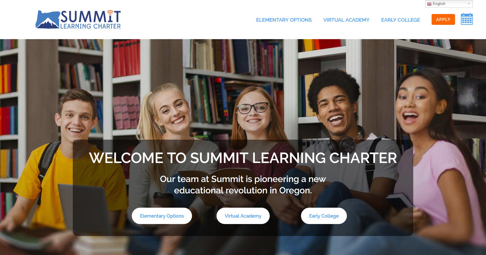
Graphically the client wanted a cleaner and more illustrative experience. We achieved this by using less text and more images in a variety of content driven layouts. I worked closely with the client until each they were happy with each one. The main design took direction from updated logo colors, for a nice cohesive feel. Use mega-menu system meant we could include many sub-menu drop down items, critical to the information restructuring.
This project included details such as:
- Working closely with the client to help them re-structure and simplify content. We brought the page count from over 160 to 60.
- Custom mega-menu for ease of navigation.
- Full custom website design.
- Google Calendar integration.
- Display of .PDF files on-page with interactive viewer.
- Multi-Language full site translation drop-down
My final thoughts:
This was a large project, with many things to consider. The most difficult part was taking all the pages, over 150, and working with the client to remove and re-arrange content until we had a leaner and easier to manage site. I think we are both really happy with how it turned out. The user experience is much more intuitive, with the site site being accessible from the main menu at a glance.
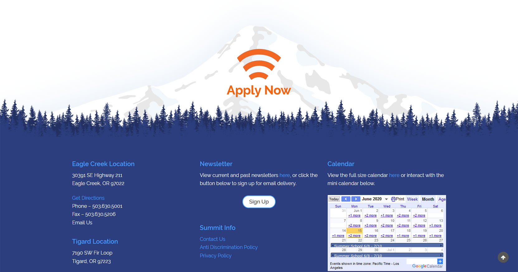
I’m also happy with the results, visually. It’s bright, clean and modern. And of course, responsive for all screen sizes. I had some fun with the design in making the mountain background above the footer. The orange “Apply Now” link really pops out. It’s a primary call to action, and as this is on every page, I think that’s a win.
Overall this project was a milestone for me, both in scope and complexity. I welcome similar projects looking forward.
What the client said:
“quote here”
The site design was modeled after the logo aesthetic, with heavy use of orange blue and white.
The footer call out area was designed to invoke the feeling of the Pacific Northwest, and to expand on the mountain theme seen in the logo.
Many pages have content driven custom layouts.
Heavy use of imagery helped move the site away from feeling too text-dense, and instead leverage imagery to convey message.


